Individual Homework #7 - Heuristic Evaluation (Group 12)
Tasks:
- Find course by number
- Find course by name
- Check for conflicts
1. Would be cool if the search function (for course number) could support both cases of having a space in between the major abbreviation and the course number (e.g. IS4300 vs IS 4300)
Heuristic: Functionality/Error Prevention
Severity: Minor
2. Would like to be able to use the 'Enter' key as a way to run the search instead of clicking each time
Heuristic: Functionality/Flexibility and Efficiency of Use
Severity: Minor
3. I really like how you have a separate box to display your search criteria separately from the check boxes and drop down menus (even though it isn't functional yet)
Heuristic: Visibility of System Status/Recognition vs. Recall
Severity: Good
4. I also like the simplicity of the drop down info for each course in the search results, and how you can open multiple at once
Heuristic: Functionality
Severity: Good
5. I know that the program is still very early in the development cycle, but I think improvements could be made to the UI in regards to spacing of the boxes on the left-hand side and the size/location of the buttons and fields within them. It took me some time to figure out where everything was at first. Try to make use of some of the white space on the left (:
Heuristic: Aesthetic and minimalist design
Severity: Major
6. Building off of comment 5, I think the interface could benefit from some additional coloring and/or color coding (as seen in the search results section) to further differentiate between the different types of search criteria.
Heuristic: Aesthetic and minimalist design
Severity: Minor
7. I dig how the search button actually acts like a button when you press and release it
Heuristic: Visibility of System Status
Severity: Good
8. The ability to drag the middle line to resize some of boxes/results section is a cool feature to have, but seems unnecessary in the context of the program.
Heuristic: Functionality/Aesthetic
Severity: Minor
9. I think the 'Clear Criteria' button is an awesome feature which would be very useful
Heuristic: Functionality/Flexibility
Severity: Good
10. Would consider moving the field for professor name horizontally in line with the CRN in the results section
Heuristic: Aesthetic
Severity: Minor
11. Probably isn't feasible for the scope of this project, but would love to see the results section immediately react to the changing of search criteria before the button is even pushed to save the user time (and maybe even expose them to courses similar to the one they are looking for)
Heuristic: Functionality
Severity: Minor
12. Again, maybe a little far-fetched but would benefit from a back button that allows the user to run previous searches again without having to re-enter all the search criteria
Heuristic: Functionality/Flexibility and Efficiency
Severity: Minor
Individual Homework #7 - Heuristic Evaluation (Group 11)
Tasks:
- Submit a challenge
- Receive a challenge
- Complete a challenge and submit a reflection
1. I like the simplicity of the menu, which allows for easy navigation between the three tasks and informs the user of which page they are currently on
Heuristic: Functionality/Visibility of System Status
Severity: Good
2. The 'WhyNot?’ text in the top left corner seems like it would be a home button since it is clickable, but it doesn’t appear to do anything. Assuming this is something you guys are going to get to later, I might link it to a new page or take out the hyperlink altogether
Heuristic: Error Prevention
Severity: Minor
3. While the confirmation text definitely does the trick, it might be useful to have additional cues that a challenge was submitted successfully (e.g. colored screen)
Heuristic: Visibility of System Status
Severity: Good/Minor
4. On the ‘View Reflections’ tab, it is displaying all the reflections for the high five a stranger task where I expected it to show me only my own. Would maybe consider noting who’s reflections you are displaying
Heuristic: Functionality
Severity: Minor
5. I enjoy the simplicity of the interface. However, I think there could be additional actions that a user might want to take within the program that could be implemented for various tasks (eg. show all available challenges)
Heuristic: Aesthetic and minimalist design
Severity: Good/Minor
6. Currently, it seems like there is only one possible challenge that can be received. I’m not totally sure how different it will look when there are more challenges added but would like to see a more definitive separation between the “Receive a Challenge” text and the actual challenge that is displayed.
Heuristic: Functionality/Aesthetic
Severity: Major
7. I really like how the text box is highlighted when you go to write a challenge to submit
Heuristic: Visibility of System Status/Aesthetic
Severity: Good
8. Similar to 5, but would like a way to select which challenge I am interested in completing (e.g. an “In Progress” notifier) or a way to view a list of challenges I have received but have not yet completed
Heuristic: Functionality
Severity: Major
9. I dig how the text is underlined when you mouse over a reflection before clicking it. Would consider adding more visual feedback on the button as well
Heuristic: Visibility of System Status
Severity: Good/Minor
10. Would like to see a way to sort and filter challenges (both received and completed)
Heuristic: Functionality
Severity: Minor
11. Would enjoy a feature which allows the user to select from a list of challenges to ‘receive’ rather than only having the option to get assigned one at random (although I do think the random challenge is a good feature)
Heuristic: Functionality
Severity: Major
12. I like the minimalist design, but would enjoy seeing more colors (or even icons) throughout the interface to make it more visually appealing.
Heuristic: Aesthetic and minimalist design
Severity: Minor
Individual Homework #3 - Ethnography
Introduction & Motivation
For my ethnography report, I decided to select entering the Snell Library as my activity to focus on. There are a few reasons I chose this particular task, the main one being that the entrance to Snell is by far the most dreaded building entrance experience anywhere on campus and has the potential to be improved. In my specific use case, I find this entrance particularly challenging because of two main reasons. One is that I ride a skateboard to get around, and have to dedicate one hand or arm to carrying it through the entrance. The second is the fact that my NU ID lives in my phone case in a sleeve with a few other cards, meaning I have to remove that specific card and tap it to the terminal each time (while some people can do this without removing the card from their wallets, the NFC chip in my smartphone interferes with the ID reader/terminal and prevents it from scanning my card).
Context
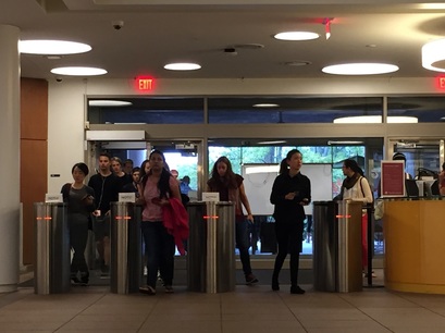
The purpose of the task is simply to enter the building while ensuring that it is in fact a Northeastern University student gaining access to all the resources that Snell Library provides. The activity requires each person entering to go through not one but two of the heaviest doors I've ever had the pleasure of opening (Note: which happen to be awkwardly close to one another) and then scanning (or swiping) their Northeastern ID on one of only three different storm trooper-esque sliding door stations. This area gets extremely congested during peak foot traffic times (typically the 10 minute intervals between classes), and squeezing fifty or more people through those three obstacles can become quite the process. It is notable that I observed the area for about an hour, beginning at 1pm on a Monday.
Users
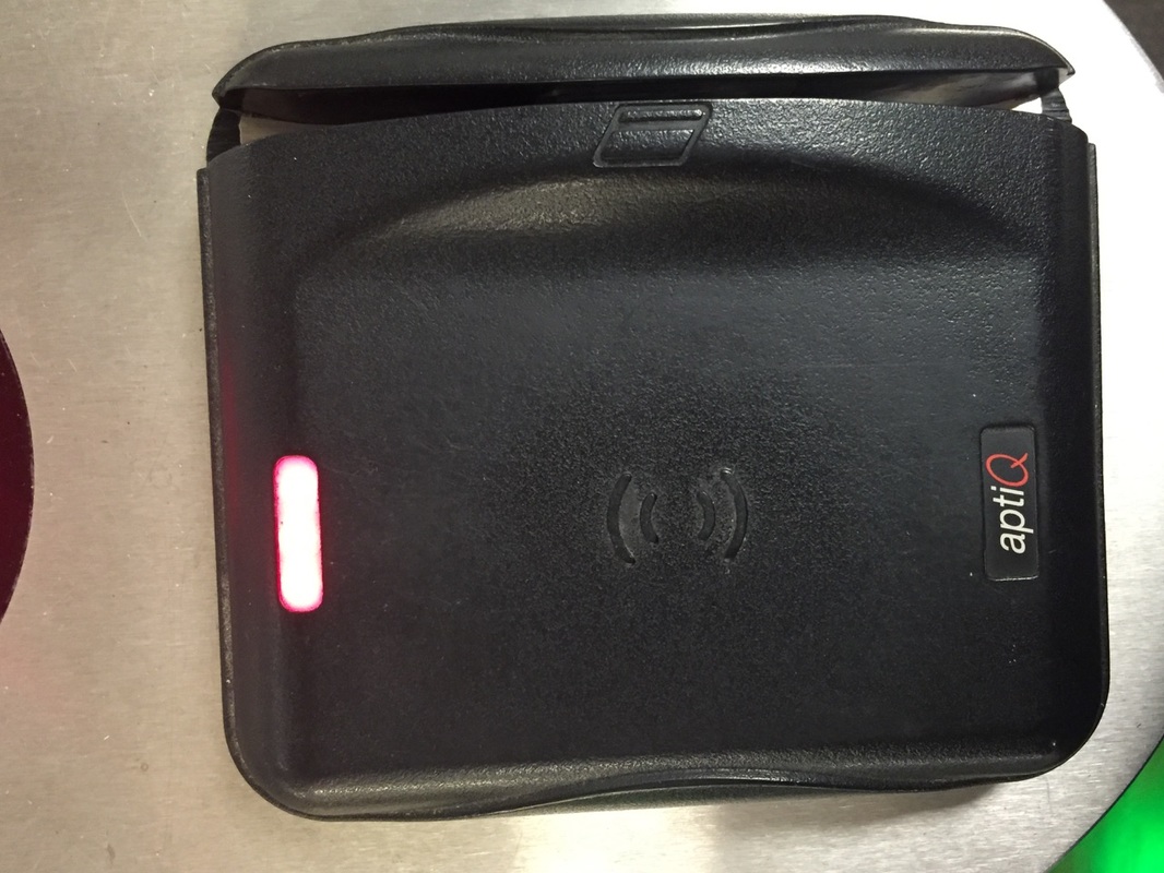
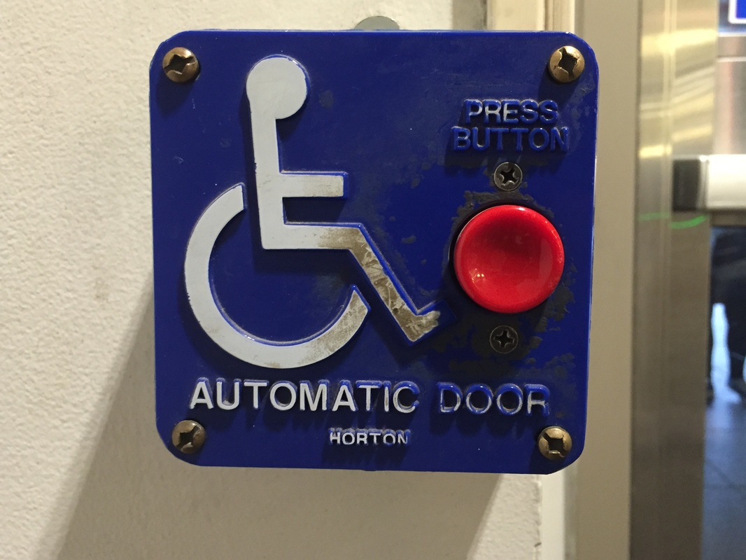
As far as the different types of people I observed engaging this activity, there were all walks of campus life that had to perform this task. In fact, every single person (minus the possibility of some faculty with access to an alternate entrance) has to go through this process every time they intend to enter the library. The vast majority of people that I observed were students heading to/from classes, appearing to be of all college ages (freshman through graduate students) and coming from all directions. Some exceptions to this appeared to be teachers/professors and library staff members or maintenance workers. The artifacts used in this activity were fairly limited to the door handles on the doors, the handicap buttons that cause the doors to open themselves, and the NU ID cards/black pads at the terminals with visuals and instructions for scanning your ID.
For my ethnography report, I decided to select entering the Snell Library as my activity to focus on. There are a few reasons I chose this particular task, the main one being that the entrance to Snell is by far the most dreaded building entrance experience anywhere on campus and has the potential to be improved. In my specific use case, I find this entrance particularly challenging because of two main reasons. One is that I ride a skateboard to get around, and have to dedicate one hand or arm to carrying it through the entrance. The second is the fact that my NU ID lives in my phone case in a sleeve with a few other cards, meaning I have to remove that specific card and tap it to the terminal each time (while some people can do this without removing the card from their wallets, the NFC chip in my smartphone interferes with the ID reader/terminal and prevents it from scanning my card).
Context
The purpose of the task is simply to enter the building while ensuring that it is in fact a Northeastern University student gaining access to all the resources that Snell Library provides. The activity requires each person entering to go through not one but two of the heaviest doors I've ever had the pleasure of opening (Note: which happen to be awkwardly close to one another) and then scanning (or swiping) their Northeastern ID on one of only three different storm trooper-esque sliding door stations. This area gets extremely congested during peak foot traffic times (typically the 10 minute intervals between classes), and squeezing fifty or more people through those three obstacles can become quite the process. It is notable that I observed the area for about an hour, beginning at 1pm on a Monday.
Users
As far as the different types of people I observed engaging this activity, there were all walks of campus life that had to perform this task. In fact, every single person (minus the possibility of some faculty with access to an alternate entrance) has to go through this process every time they intend to enter the library. The vast majority of people that I observed were students heading to/from classes, appearing to be of all college ages (freshman through graduate students) and coming from all directions. Some exceptions to this appeared to be teachers/professors and library staff members or maintenance workers. The artifacts used in this activity were fairly limited to the door handles on the doors, the handicap buttons that cause the doors to open themselves, and the NU ID cards/black pads at the terminals with visuals and instructions for scanning your ID.
|
|
"Double glass doors makes sense for insulation, especially during the summer and winter. The slidy doors are technically an improvement from their earlier system, but in between classes when there's a swarm of people coming in it doesn't make any sense. Understandable that you need to keep riff raff out, but merely three doors for a university of this size is ridiculous... Typical Northeastern." |
|
I noticed one person was a little eager while scanning his ID card and attempted to walk through the doors before the machine had properly scanned his ID, causing him to slam into them and rescan his card. It seemed that the delay between tapping the card to the reader and receiving the approving 'beep'/green light was a common nuisance for library-goers, and often times resulted in having the user re-scan their NU ID.
Individual Homework #2 - UI Critique
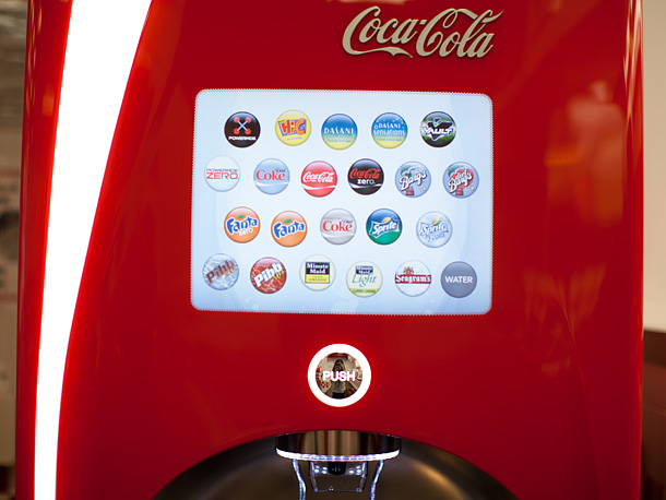
One example of a good user interface design is the all-in-one soda machines that they have at places like Q'doba and 5 guys. The purpose of the interface is to let the user pick which beverage they would like that dispenses out of a single nozzle. I really like the layout of the soda options, which comes in neat, even bubbles with pictures of the logo soda of choice (visibility, mapping, consistency). It does not provide clear instructions on how to interact with the interface (touching the circles for the soda you want), but the interface is clearly a touchscreen and is fairly intuitive for even the most ignorant of users , and after selecting a brand it navigates to another menu with the different varieties of that soft drink and provides a clear, colored back button (consistency, minimizing user memory load, clearly marked exits). It also grays out the button when the machine is out of a certain syrup, letting you know that soft drink is not an option (good error messages).
There is a bad aspect of this user interface however, which is a redundancy in only one of the options. When you select water, it still brings you to a 'sub menu' to let you choose your variety of water. However, there is only one option... (water), which is a redundant step that could easily be taken out and allow for quicker water dispensing.
There is a bad aspect of this user interface however, which is a redundancy in only one of the options. When you select water, it still brings you to a 'sub menu' to let you choose your variety of water. However, there is only one option... (water), which is a redundant step that could easily be taken out and allow for quicker water dispensing.
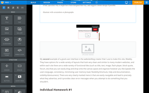
My second example of a good user interface is the website/blog creator that I use to make this site, Weebly. They have options for a wide variety of layouts that look very clean and similar to many modern websites, and within each site there are a wide variety of functional tiles (such as title, text, image, flash player, block quote, forum, etc) that you can easily drag and drop onto the canvas space and organize however you like (speaks the users language, consistency, minimizing user memory load, flexibility/shortcuts, help and documentation, visibility/obviousness). There are very clearly marked menu's that are easily navigable and lead to precisely what they advertise, and it provides clear error messages when you attempt to do something that you shouldn't.
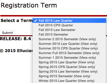
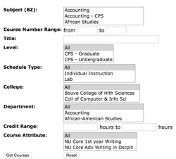
My last example of a bad user interface is the myNeu course registration page, which requires you to run a degree audit on a separate portal, figure out what options for courses you have that will help fulfill your major/minor requirement, then go and check a separate course catalogue where you have to write down the days/times of the specific courses you want and check against overlaps yourself (user memory load, flexibility/shortcuts). The menus (which force you to go through an initial selection page each time) require you to select the term and specific school (undergraduate, graduate, law, etc) each time you want to run a search, and to top it off there are two different portals for browsing courses which are separated only because they allow for two different kinds of searches (one regular, one more advanced), both of which require certain fields to be filled out while others can be left blank. The overall visibility is incredibly plain and stale with no obvious text or buttons that point you in the direction you want to go (everything looks the same essentially, which i guess is good for consistency). Additionally, there is a separate portal for viewing your current schedule, but it merely lists the basic course information with text and provides no visual cues as to what kind of overlap you might have with your courses, let alone a clear representation of what your schedule looks like on a weekly basis. Unfortunately since course registration is closed, I am unable to view certain aspects of the site but I have included a few images that highlight some of the pains of the service.
Individual Homework #1
Project Idea 1: One project idea that I've always wanted to explore is redesigning parts of the user interface and basic functionality of the website Soundcloud. Soundcloud is a platform used by musicians and producers of all different varieties to share their music with a massive community. The site has had the same basic structure since its inception, and while it recently was re-skinned to look a bit cleaner (especially on mobile), the underlying functionality of the site could use a lot of very simple advancements that would greatly improve the user experience. More specifically in the case of power users such as myself, basic features like time stamps, "silencing" artists, and viewing customizable streams would be greatly desirable and could be easily implemented.
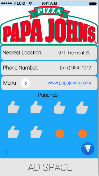
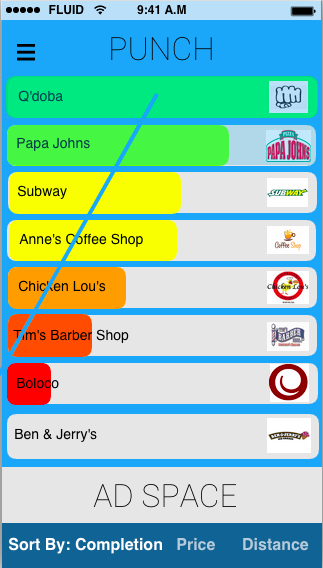
Project Idea 2: App for tracking rewards at various stores/restaurants. Would include multiple views for overall progress, map/location, types of food and individual businesses.
Project Idea 3: A platform for greek life to connect within a university, similar to Facebook but with respect to setting up fundraisers, volunteering events, socials, etc.
Project Idea 4: MyNeu/course registration clean up